


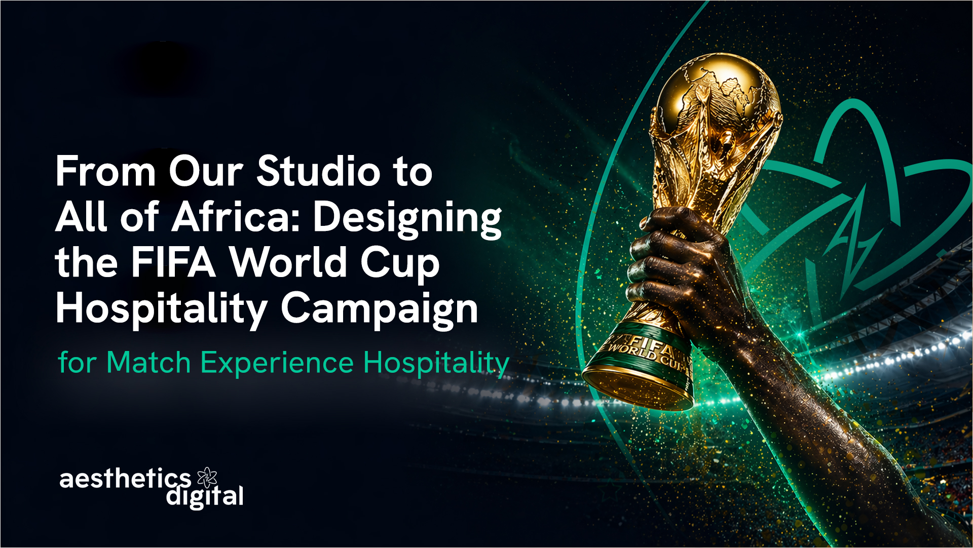
20,000 brochures. 68 bank branches. One continent.
That's what this campaign became.
But when the brief landed on our desk, it looked deceptively simple:
Design a standee and brochure system for Africa's leading sports hospitality brand that had to work from Accra to Lagos to Johannesburg.
This post is a full breakdown of how we did it. The strategy, the design decisions, what worked, and why physical print still wins in ways digital never will.
Let's get into it.
Who Is Match Experience Hospitality?
Match Experience Hospitality is Africa's official sales agent for ticket-inclusive sports hospitality packages.
They don't just sell tickets. They sell the full VIP experience, from wheels-down to final whistle.
We've worked closely with the Match Experience team across brand and digital including building and designing their website from the ground up. So when this campaign brief came in, we already understood the brand at a deep level.
Their event portfolio includes:
- FIFA World Cup 2026™
- UEFA Champions League
- Formula 1
- Roland Garros
- Wimbledon
- Australian Open
- AFCON and La Liga
They operate across 16+ countries from five regional hubs, with a 100% official ticket guarantee and a payment partnership with ABSA Bank, one of Sub-Saharan Africa's largest financial institutions.
Their positioning is sharp:
"From our African roots to the global stage, we have grown into a premier force in international event hospitality."
That's a clear brand identity with real strategic weight behind it.
The Brief: A Campaign That Had to Travel
This wasn't a social media campaign or a landing page project.
This campaign had to exist in physical space. Across countries. Inside 68 bank branches.
The ask: design a standee and brochure system for FIFA World Cup 2026™ hospitality packages that could be deployed consistently across Ghana, Nigeria, South Africa, Kenya, and beyond, all through ABSA Bank branches.
Why ABSA branches?
Because that's where the audience already is.
ABSA customers are aspirational. Financially active. Thinking about their next big move. These are exactly the people considering a premium World Cup experience, and they're already standing in that building making financial decisions.
The distribution strategy was built into the brief itself.
Our job was to make the design do the selling.
The Design Challenge: Premium Without the Distance
Here's the tension we had to resolve.
The product is undeniably high-end. VIP seating, private lounges, full travel packages, ABSA Visa Free Travel Cards. This isn't a budget offering.
But the audience includes a wide spectrum of people, including those who might look at a premium hospitality campaign and think: "Is this actually for someone like me?"
Getting that wrong in either direction kills the campaign.
Too exclusive? You lose the audience. Too accessible? You undermine the product value.
The design had to say: "This is premium. And it's absolutely for you."
That's a tightrope. Here's how we walked it.
The Visual Direction
We built the visual language around three principles:
1. Energy over elegance
The World Cup is electric. The design needed to carry that energy, not suppress it for the sake of looking "sophisticated." Big, bold, directional.
2. Gold that grounds, not gold that excludes
Gold tones signal prestige, but the wrong execution makes a campaign feel untouchable. We kept the palette warm and African-inspired, so it felt earned and familiar rather than cold and distant.
3. Readability at distance
These standees live inside busy bank halls. Someone glancing from 15 feet away needs to get the message in under three seconds. Clean, modern typography. Icons that tell the story at a glance. No visual noise.
The goal was simple: someone walks in for a routine banking errand, looks up, and immediately thinks — "I need to find out more about that."
Hook first. Depth second.
We've written about the design decisions that quietly destroy conversions before, and many of the same principles applied here. Clutter is the enemy of action, whether that's on a screen or a standee in a bank hall.
The Brochure Suite
The standee grabs attention. The brochure closes it.
We designed the brochure to serve two very different readers:
- The quick skimmer who needs the headline offer and a call to action
- The detail reader who wants to understand exactly what they're getting before they commit
The full package breakdown inside covered:
- Official match tickets (guaranteed)
- Economy class flights (upgradeable)
- Hotel accommodation
- Ground transportation and city tours
- Travel insurance
- ABSA Visa Free Travel Card with $100 credit
- How to register and how payments work
The hardest part? Maintaining consistency across geographies.
A standee placed in an Accra branch and one in a Johannesburg branch had to feel like the same campaign, because they are. One brand. One story. One visual system.
We built it that way from the start.
The Rollout: By the Numbers
When the materials shipped, the scale made it real:
- 20,000 brochures printed and distributed
- 68 ABSA Bank branches across Sub-Saharan Africa
- Countries reached: Ghana, Nigeria, South Africa, Kenya, and beyond
That's physical presence at scale, in the exact locations where people make financial decisions.
You can't replicate that with a Facebook ad.
Digital gets you reach. Print inside a bank gets you attention at the moment of financial intent.
Those are two very different things. And it connects to a broader shift we've been tracking: as digital spaces get noisier and more synthetic, physical and human-first communication is making a real comeback. Brands that understand this are already ahead.
Why This Campaign Matters
FIFA World Cup 2026™ is the biggest edition in tournament history.
- 48 teams (up from 32)
- 104 matches
- 16 cities across the United States, Canada, and Mexico
- More African representation than any previous tournament
African football is having its moment. The players are on the world stage. The fans are paying attention. And the question a lot of people are quietly asking is:
"Can I actually be there?"
Match Experience Hospitality exists to answer that question with a yes.
This campaign helped turn "what if" into "here's how."
Every brochure in a bank branch is a permission slip to think bigger. Every standee is proof that a World Cup trip isn't a fantasy — it's a plan you can start today.
What We Learned
A few things this project reinforced for us:
- Brief clarity makes everything faster. Match Experience Hospitality came in knowing their audience, their message, and what emotional job the design needed to do. That kind of alignment shortens the creative process significantly and sharpens the output.
- Distribution is a strategy, not logistics. The decision to use ABSA Bank branches wasn't just practical but it was strategically smart. It placed a luxury sports product in front of financially engaged people in a context where spending decisions feel normal.
- Print isn't dead. Context is everything. A well-designed brochure inside a bank hits differently than a digital ad. The physicality of it; someone can pick it up, take it home, leave it on their kitchen table — changes the conversion dynamic entirely.
If you're working on a campaign that needs to travel across cultures and geographies while maintaining brand coherence, the answer isn't to simplify. It's to build a tighter visual system.
Want to See What We Built?
You can view the full Match Experience Hospitality case study on our website, including the standee designs, brochure layouts, and the thinking behind the visual direction.
👉 View the Match Experience Hospitality Case Study
Aesthetics Digital is a performance-driven digital marketing agency with offices in Dover, Delaware and London, UK. We work with brands across hospitality, healthcare, home improvement, and more, from web design and SEO to brand identity and print campaign design.
Ready to build something that actually converts? Let's talk.

At Aesthetics Digital, big ideas deserve bold execution.
Table of Content


%20(1).png)


.svg)

.svg)
.svg)


.svg)
