Sixty Secs
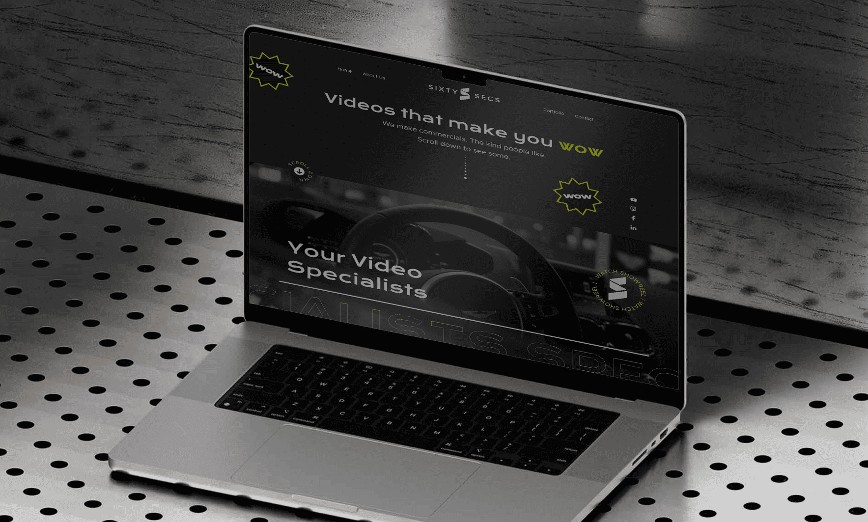
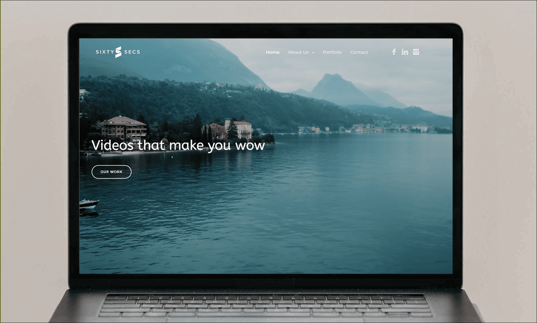
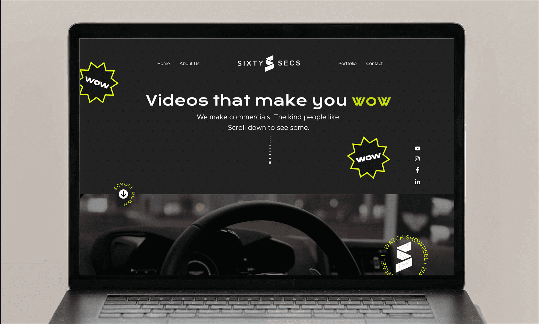
In this case study, we delve into our successful collaboration with Sixty Secs, the video specialists who specialize in creating captivating commercials. Discover how our UI/UX services played a pivotal role in transforming their website into an immersive platform with a unique dark theme infused with neon colors.
Date
2024
Client
Sixty Secs
Category
UI/UX

The Challenge
Sixty Secs is dedicated to producing compelling video content, and they sought to elevate their online presence to reflect their innovative and creative approach. They faced the challenge of designing a website that would effectively showcase their portfolio of commercials and create an immersive user experience. They approached us to enhance their website's UI/UX, and our case study demonstrates how we met this challenge head-on.

The Solution
Our solution for Sixty Secs revolved around redesigning their website to align with their brand identity and the dynamic nature of video production. We envisioned a dark-themed website with touches of neon colors that would convey the excitement and creativity of their work while ensuring a user-friendly experience.

Key Components
Dark Theme with Neon Accents: We created a visually striking dark-themed website with neon accents that immediately captured visitors’ attention and conveyed the excitement and innovation associated with video production.
Intuitive Navigation: We implemented an intuitive navigation system that allowed users to easily explore Sixty Secs’ portfolio, services, and contact information, creating a seamless and enjoyable browsing experience.
Engaging Portfolio Showcase: We designed a portfolio showcase that highlighted their commercial projects with dynamic visuals and interactive elements, allowing visitors to dive into their work.
Responsive Design: The website was optimized for various devices, ensuring that users could enjoy a consistent and engaging experience whether browsing on desktop, tablet, or mobile.
User-Centric Approach: Throughout the design process, we maintained a user-centric approach, ensuring that the website effectively communicated Sixty Secs’ creative prowess and encouraged users to explore their video services.
Results
- Immersive User Experience: The dark-themed website with neon accents created an immersive user experience that effectively conveyed the creativity and dynamism of Sixty Secs’ work.
- Enhanced Portfolio Presentation: The engaging portfolio showcase allowed Sixty Secs to effectively showcase their commercial projects, capturing the attention of potential clients and collaborators.
- Increased User Engagement: The visually striking design and intuitive navigation led to increased user engagement, with visitors spending more time exploring the website and its content.
- Positive Brand Perception: The website’s design reinforced a positive brand perception, positioning Sixty Secs as innovative and creative specialists in the world of video production.
- Improved Accessibility: The responsive design made the website accessible to a broader audience across various devices, ensuring a seamless experience for all users.


