Delaware’s Top Rated Digital Marketing, Web Design & SEO Agency


Our Journey to Building Success
Our Services
Transforming your ideas into stunning digital realities.
%20(1).webp)
Web Design & Development (WDD)
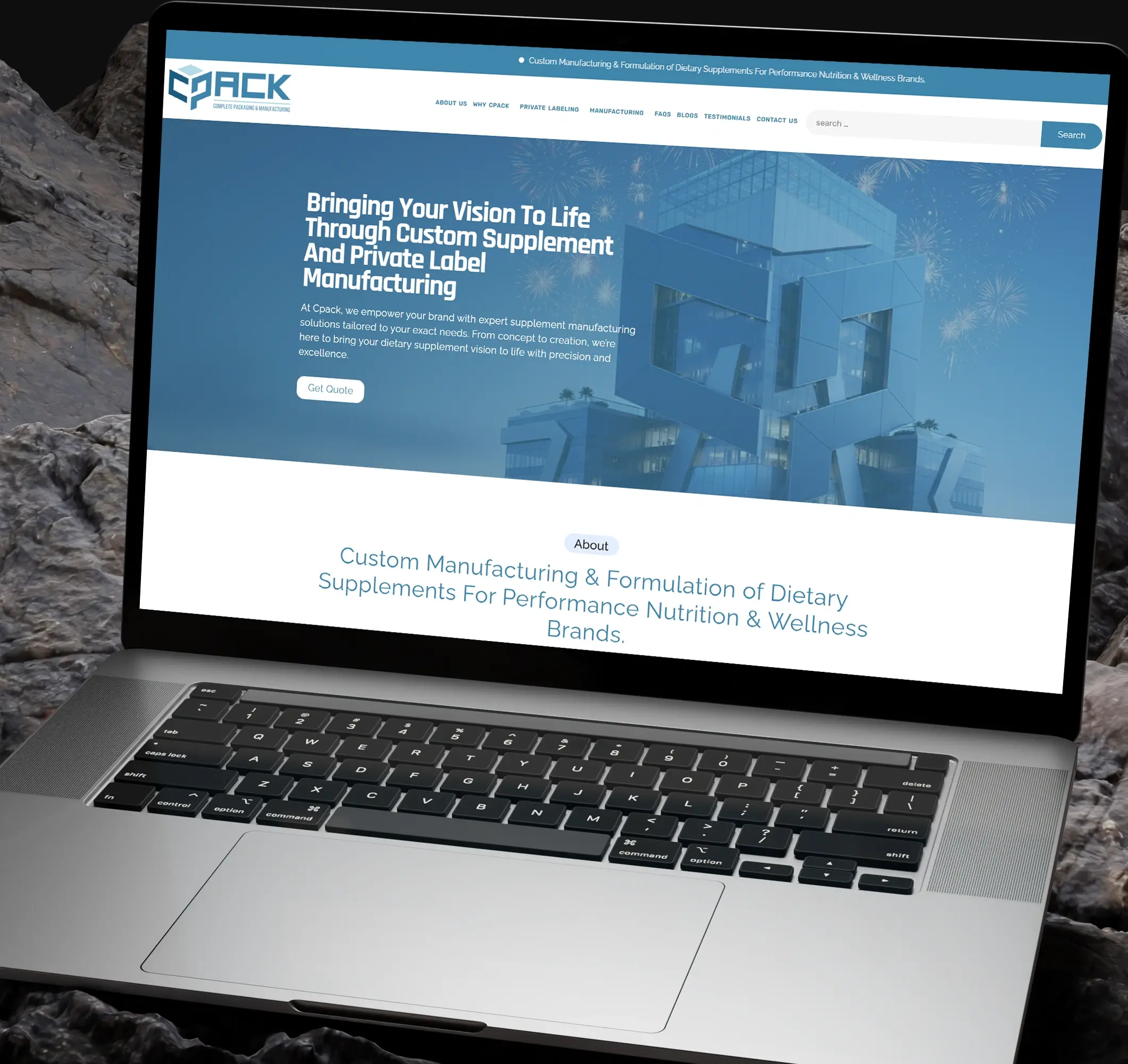
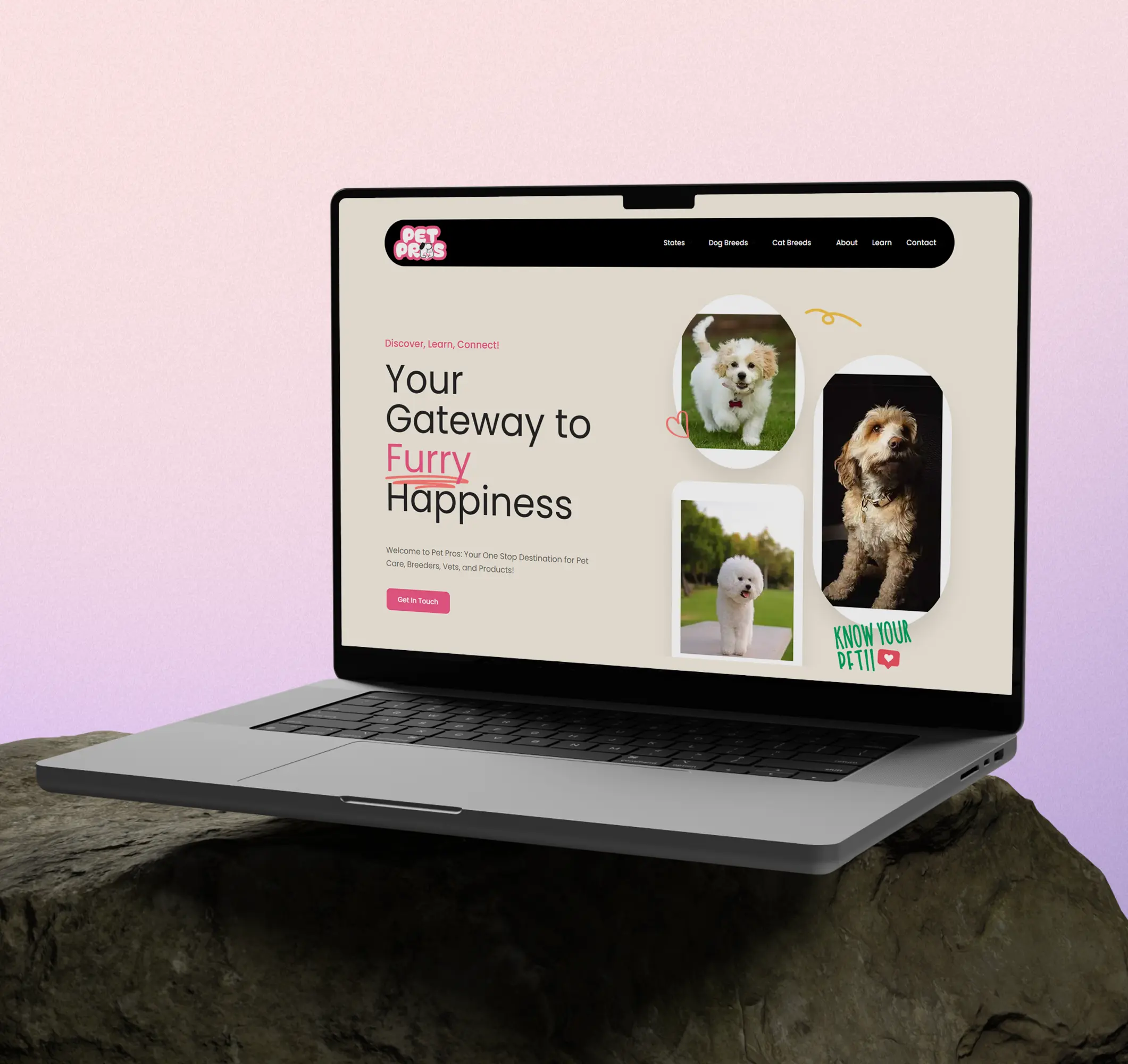
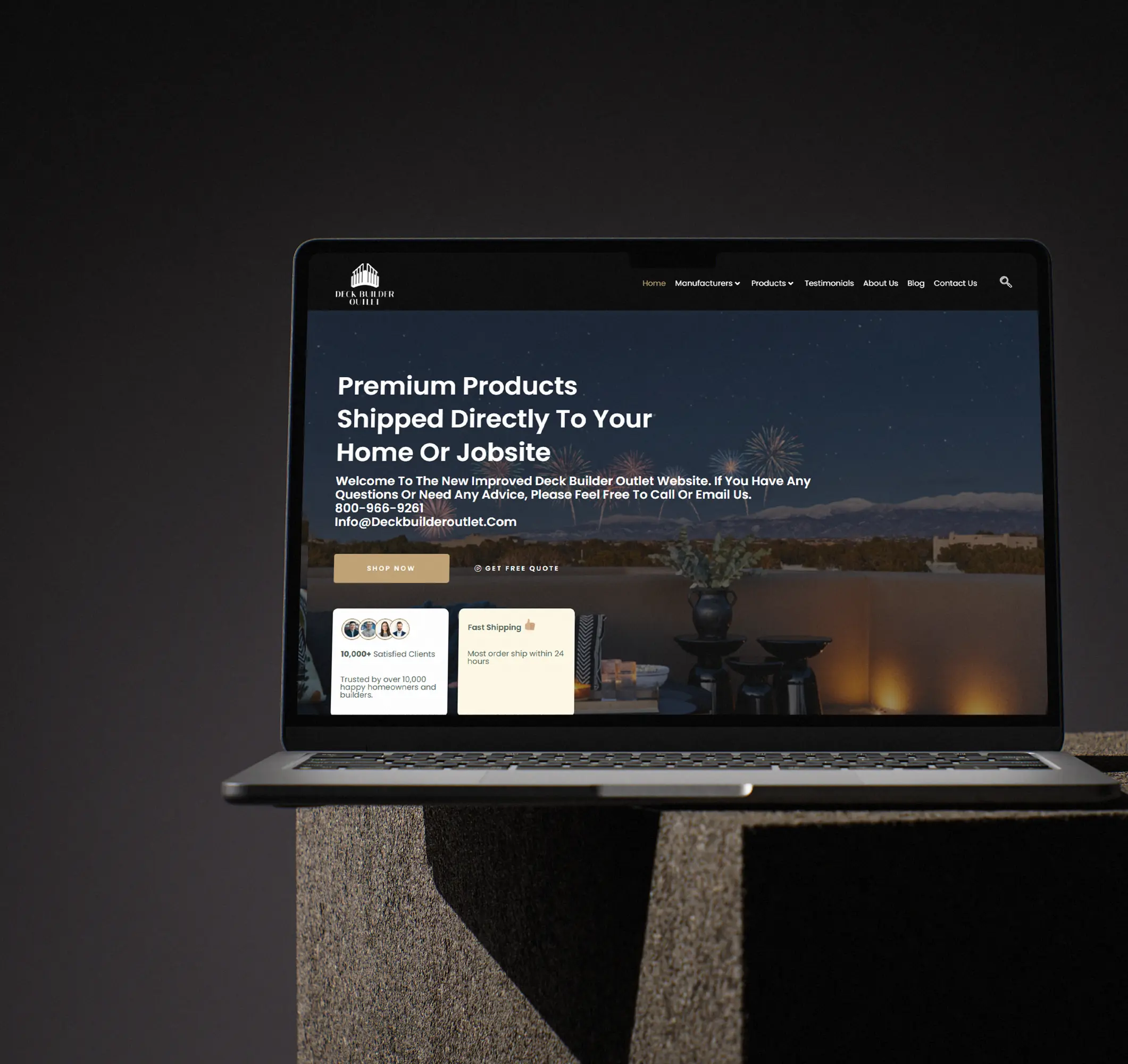
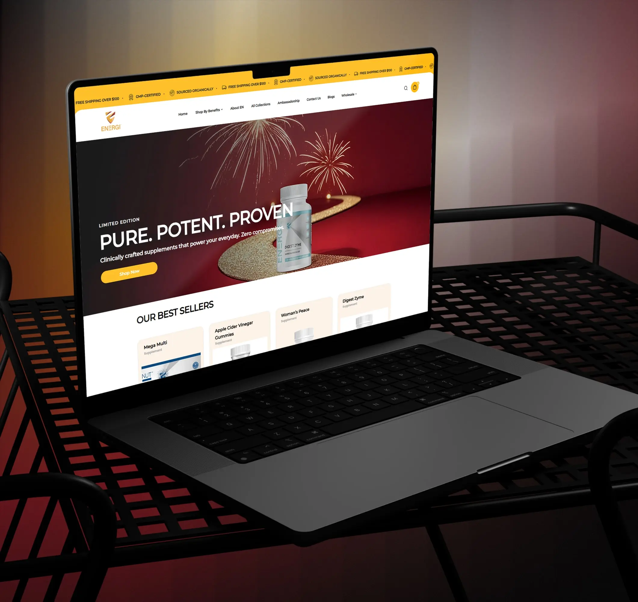
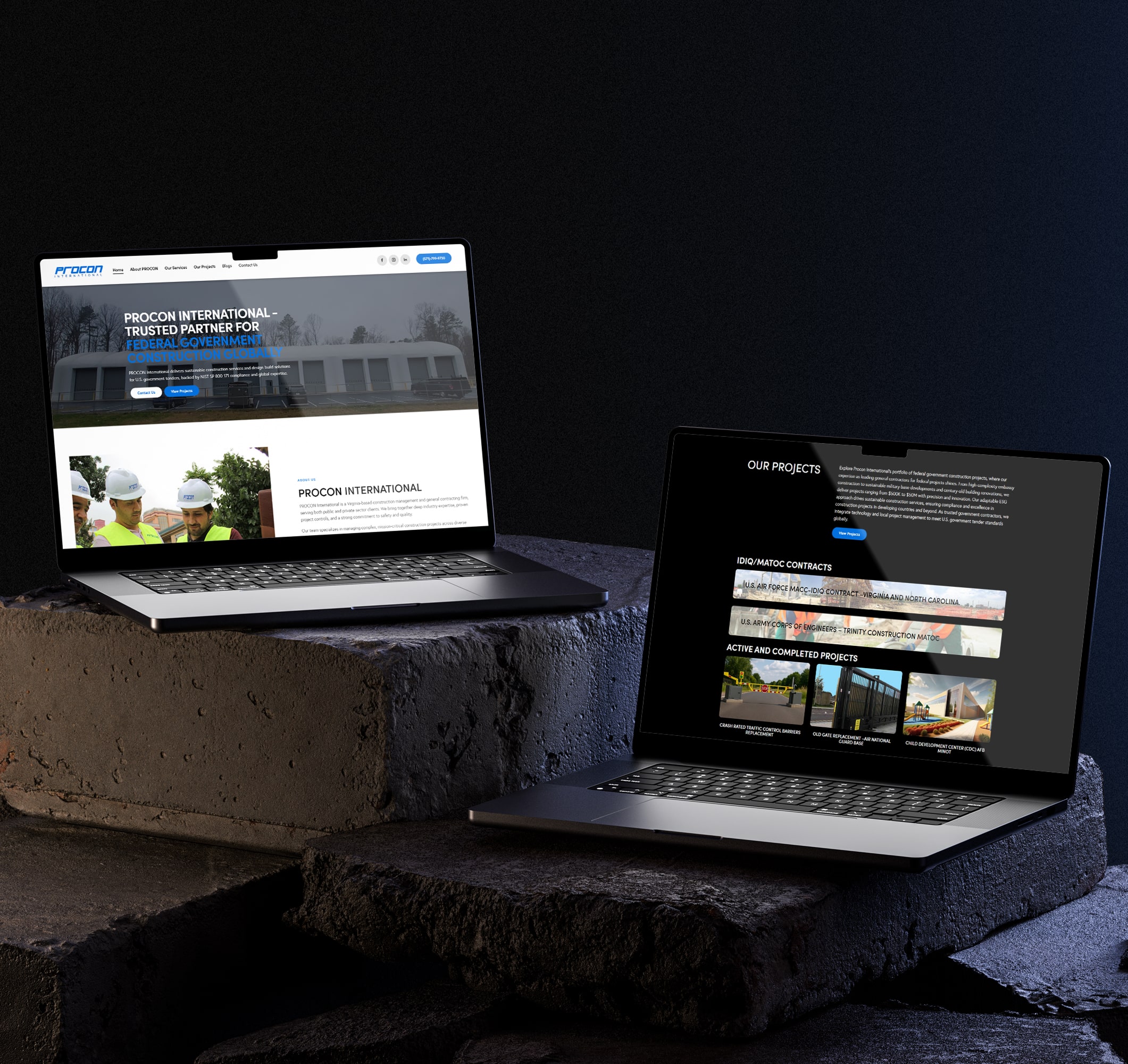
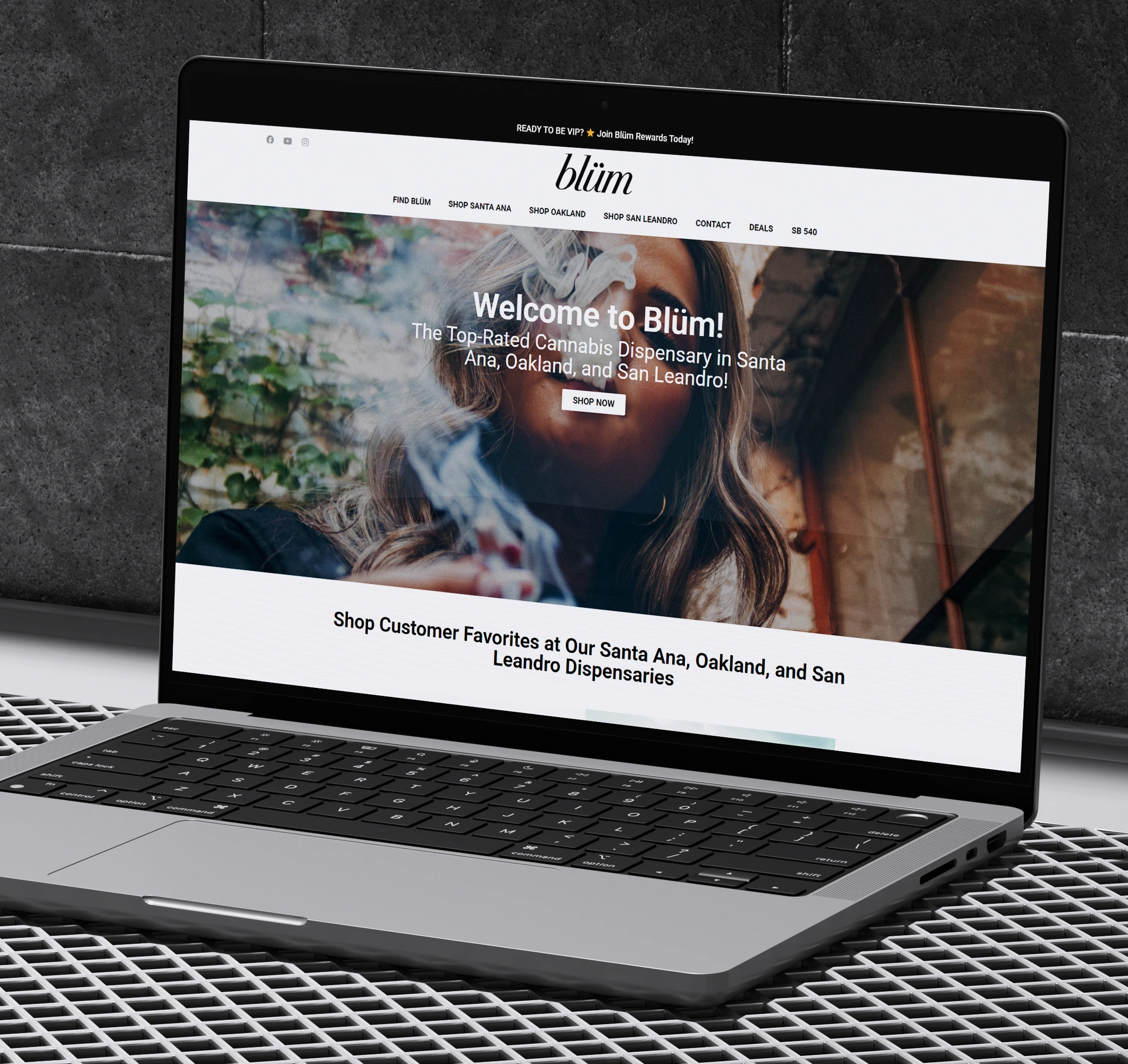
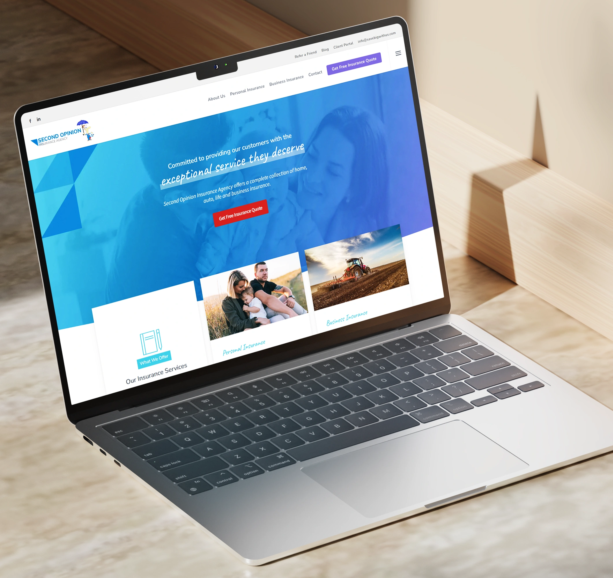
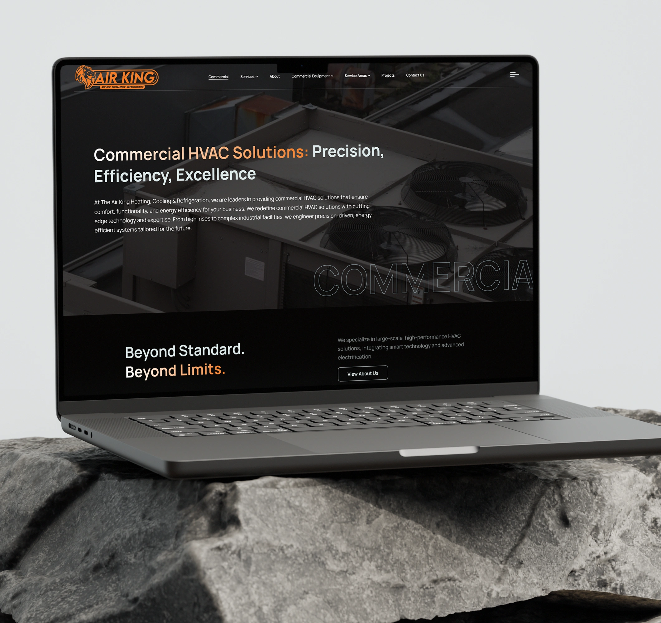
We design websites as high-conversion environments, combining minimalist aesthetics with a hand-picked stack of 350+ tools to create digital homes that are fast, intuitive, and beautiful. Prioritizing First Contentful Paint (FCP) and UX architecture, our Webflow-first builds typically reduce bounce rates by 30–50%, ensuring credibility and performance go hand-in-hand.
.svg)
.webp)
Search Engine
Optimization (SEO)
SEO at Aesthetics builds technical and content ecosystems aligned with search intent, not fleeting algorithms. Our structured frameworks have generated a 49% increase in organic traffic within four months, while optimizing for Search Generative Experience (SGE) positions brands as authoritative, long-term answers in their niche.
.svg)
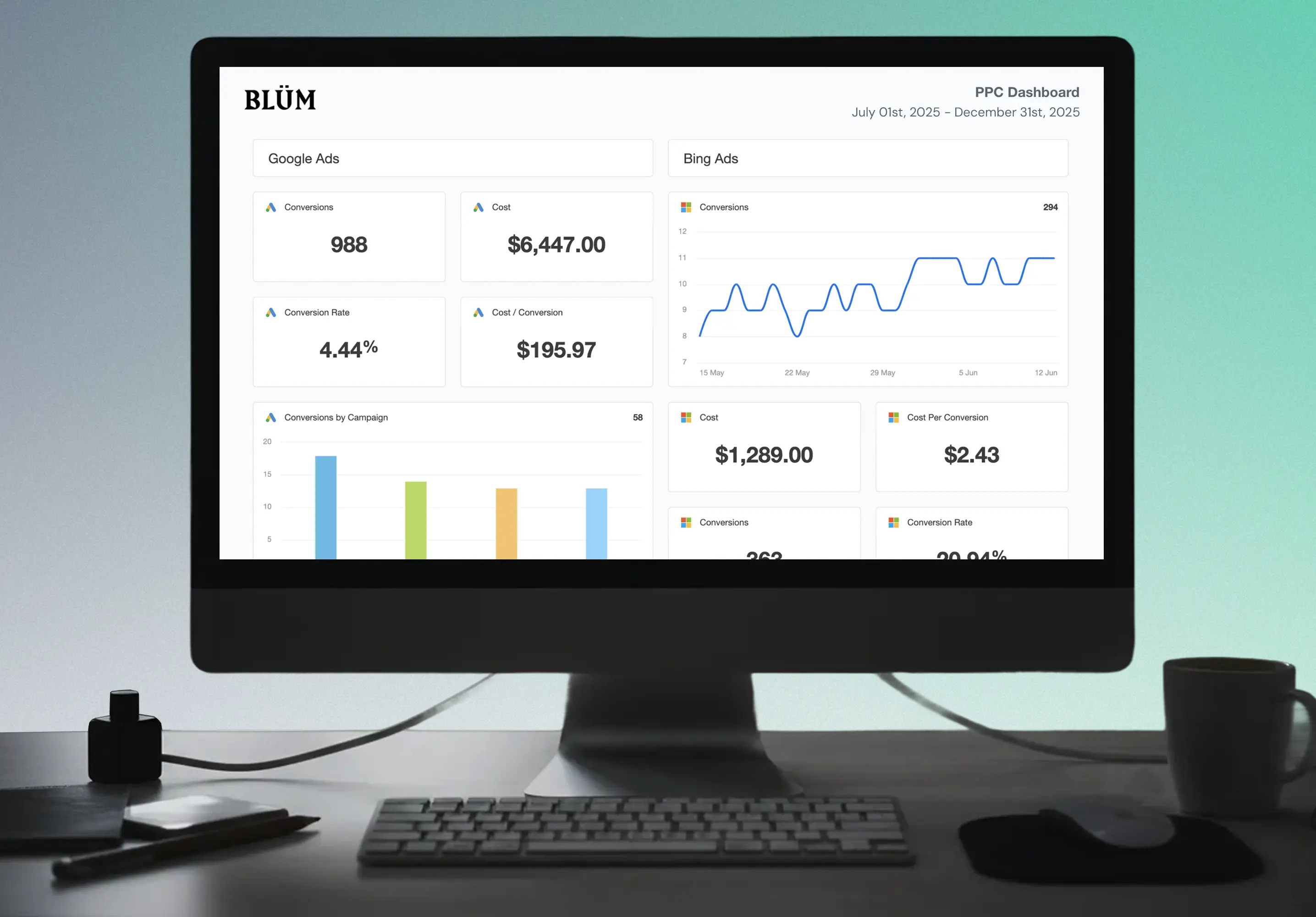
Pay Per Click (PPC)
Paid media works when targeting, testing, and landing experiences are aligned with intent. By hyper-segmenting audiences and continuously optimizing campaigns, we help partners achieve up to a 288% increase in conversion rates while lowering CPA, turning budgets into accountable, scalable investments.
.svg)
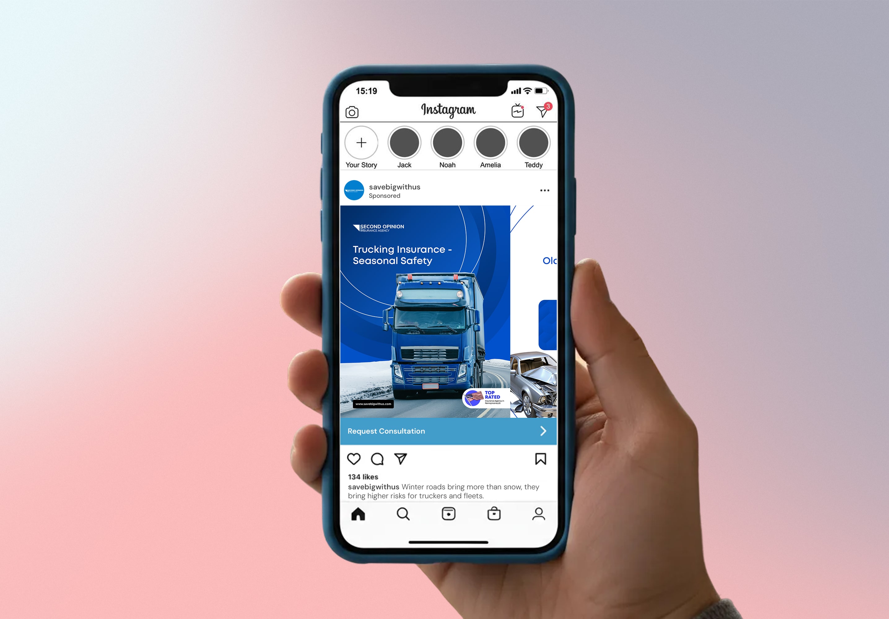
Social Media Marketing (SMM)
Social media is where brands are experienced. We create human-centered, visual-first campaigns that combine creative storytelling with data-driven distribution, turning passive attention into engagement. Brands leveraging this approach see 94% more engagement, building connection, trust, and lasting perception.
.svg)
Proven Results for Delaware Businesses
.svg)
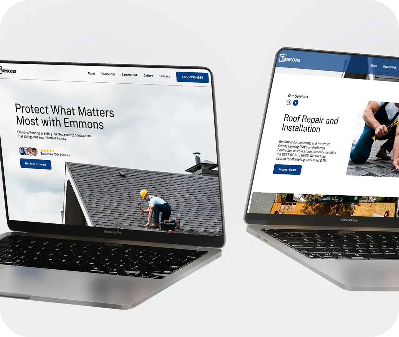

Emmons
For Emmons, we refined their paid media approach to focus on intent, not volume. By restructuring campaigns around high-quality search behavior and aligning them with relevant landing experiences, we reduced acquisition costs while increasing lead consistency. The result was a paid strategy built for efficiency and scale

.svg)
Windfree Solar
Widfree Solar needed visibility in a competitive and fast-growing market. We developed an SEO strategy centered on technical strength and meaningful content, allowing the brand to earn authority over time. This approach improved rankings for key terms and established a reliable source of qualified organic traffic.

.svg)
Match Experience Hospitality
For Match Experience, the goal was clarity as much as aesthetics. We designed a website that reflects the quality of their hospitality offerings while guiding users smoothly toward booking. The platform balances strong visuals with intuitive structure, making the experience both engaging and easy to navigate.
.svg)
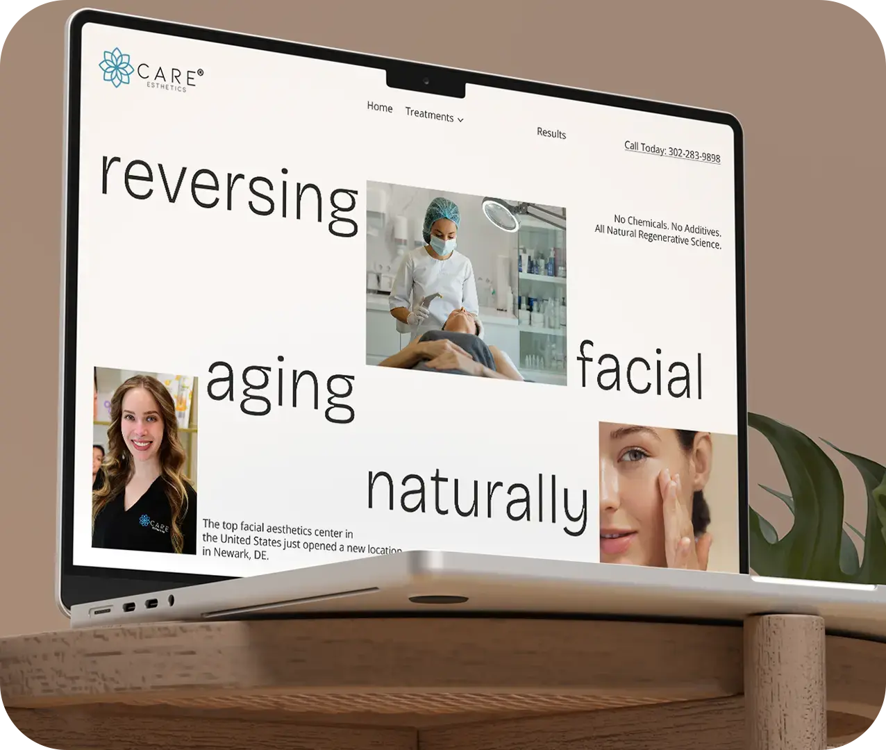
Care Esthetics
Care Aesthetics operates in a space where credibility matters. We implemented a digital marketing strategy that combined targeted outreach, consistent messaging, and social validation. The focus was not just on reach, but on building confidence—supporting long-term brand growth aligned with their standard of care.
We Build Brands That Stick in Minds & Win Online | For Free Consultation Call 872 278-4248 | We Build Brands That Stick in Minds & Win Online | For Free Consultation Call 872 278-4248 | We Build Brands That Stick in Minds & Win Online | For Free Consultation Call 872 278-4248
We Build Brands That Stick in Minds & Win Online | For Free Consultation Call 872 278-4248 | We Build Brands That Stick in Minds & Win Online | For Free Consultation Call 872 278-4248 | We Build Brands That Stick in Minds & Win Online | For Free Consultation Call 872 278-4248
Our 4-Step Proven Growth Blueprint
From first hello to measurable success. Here’s how we make it happen.
1. Discover & Deep Dive
2. Strategize & Custom-Craft
3. Launch & Amplify

4. Optimize & Scale
We Use Leading Technologies That
Help You Grow
We work with 350+ hand-picked tools to scale meticulously in web, mobile, SEO and
software development. Skilled in the latest tech, they plug right into your team and help you
move faster without the stress of hiring.


.svg)
.svg)


.svg)









%20(1).png)
.jpg)

.svg)

.svg)
.svg)


.svg)
